Warm white light (2700K–3000K) is usually best for eye comfort, while neutral white light (3500K–4000K) works better for reading and focused tasks. Notice the light when you walk into a room. It does more than just light up a room; it also sets the mood, directs your attention, and even tells your body when to relax or stay alert. If you choose the wrong light, your eyes will feel it: a little tension, tiredness, and maybe even a headache after a few hours. By choosing the right one, not only will your room feel more cozy, but it will also make your work smoother.
If you want the best LED light colour for eyes, it’s not about buying the brightest bulb. It’s about choosing the right Kelvin range so your eyes feel calm, focused, and comfortable in each room.
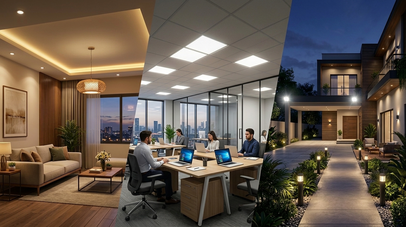
Warm, Neutral, or Daylight? Here’s the Kelvin Difference
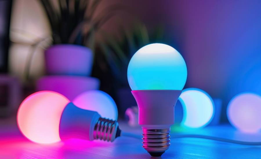
Light isn’t just bright or dim; it also has a temperature. Think of it like the difference between the warmth of a cup of tea and the coolness of the air in the morning. This is known as colour temperature in terms of lighting, and it is measured in Kelvin (K).
- Lower Kelvin (2700K–3000K): The light is warm, soft, and yellowish, making it feel cozy and gentle.
- Medium Kelvin (3500K–4000K): White that is neutral, clear, and balanced.
- Cool white or daylight with a higher Kelvin (5000K–6500K) is bright, energizing, and bluish-white.
Think of a warm light coming from a glowing ember in a fireplace and a cool light coming from the clear noon sun coming through a window. Each one has a job.
| Kelvin Range | How it feels | Best for | Avoid when |
| 2200K–2500K | Extra warm, candle-like, very soft | Night lamps, bedtime wind-down, cozy corners | Detailed work or long reading (can feel too dim/yellow) |
| 2700K–3000K | Warm white, calm, easy on the eyes | Bedrooms, living rooms, relaxing spaces, and reading before sleep | Precision tasks (fine print, long desk sessions) |
| 3500K–4000K | Neutral white, clean, balanced | Study rooms, home office, kitchen, task zones | Late-night use if you’re sensitive to brighter light |
| 5000K–6500K | Cool white/daylight, bright, sharp | Garages, workshops, daytime task areas | Bedrooms and evening use (often feels harsh, can affect wind-down) |
Best LED Light Colour for Eyes: Room-by-Room Guide
Now that we understand the temperatures, let’s see how they transform the different spaces in your home.
1. Living Room: The Balance of Warmth
Think of a warm night in the living room. The room is softly lit by neutral white light, which makes everything feel clear and comfortable.
You can read a book, talk to family, or play a board game without your eyes getting tired. With a little warm yellow light from a table lamp or corner accent, the room suddenly feels layered and welcoming.
It’s bright enough to see clearly but soft enough to relax. If you want it simple: aim for 3000K–4000K, then use a warm lamp (around 2700K) to make it feel cozy.
2. Bedroom: A Place for Your Eyes to Rest
The bedroom is a place where you need to rest, so the light there should be softer and warmer, wrapping around the room’s edges like a gentle hug.
Around 2700K–3000K, warm white LEDs make the best place to read before bed. The warmth tells your body to relax, and your eyes don’t have to fight glare.
Here, bright, cool lights would be too bright and would mess up your natural sleep cycle. The bedroom is a place to let go of the day, and the right light makes that easy.
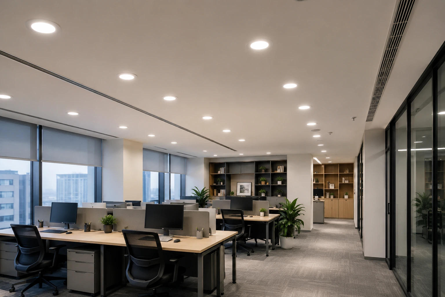
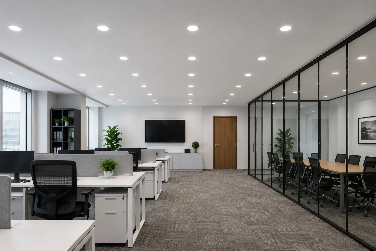
3. Study Room or Home Office: Clean, Comfortable, and Focused
For a study room or home office, you need to pay attention to the task at hand, and your eyes need support, not strain. The neutral white light (3500K–4000K) that shines on your desk makes every page, screen, and note clear.
The light feels natural; it’s not too yellow to make you sleepy or too blue to make your eyes tired. Carefully position it so that it evenly lights up your workspace. Shadows behind you can sneak up on your eyes, making it harder to read and making you tired faster.
4. Reading Corners and Places to Relax
Picture a small armchair or a cozy nook by the window with indoor lighting. Soft, warm white light makes reading feel easy. Your eyes stay relaxed, so you can sit longer without that tired, heavy feeling.
It’s the kind of light that doesn’t yell at you; it just lets you relax and enjoy the moment. For a reading nook, stick with 2700K–3000K so the light feels soft instead of “loud.”
How to Reduce Eye Strain with LED Lights
Here’s the part most people miss: they focus on brightness rather than looking at the whole picture. You can pick the perfect Kelvin and still feel eye strain if the bulb flickers, glares, or is simply too bright for the space.
So if your eyes still feel tired even after choosing warm or neutral light, don’t assume it’s “just you.” It’s usually one of these small things in the setup that quietly creates discomfort over time.
If you are exposed to blue light late at night, it can mess up your sleep. A high Colour Rendering Index (CRI) makes sure that colours look natural, which means your eyes don’t have to constantly adjust, which is a small but important detail for long-term comfort.
A Quick Checklist
If you want lighting that actually feels easy on your eyes day to day, here’s a quick checklist I use before buying any bulb:
- Go flicker-free (especially for study rooms and bedrooms)
- Pick warm white at night (2700K–3000K) so your eyes can relax
- Use neutral white for focus (3500K–4000K) so pages and screens look clear
- Choose a higher CRI if you can (colours look more natural, and your eyes don’t “work” as hard)
- Watch glare (a shaded lamp or diffuser often feels better than a naked bright bulb)
- Avoid super bright bulbs in small rooms (use a dimmer or lower lumens).
It’s small stuff, but it makes a big difference when you’re living under that light every day.
Key Takeaway:
Lighting isn’t just about seeing, it’s about feeling. Pick the right LED bulb light, and your rooms will feel welcoming, your work will flow, and your evenings will be relaxing. Choose carefully from the best LED light colours, and your eyes will thank you every day.
Frequently Asked Questions (FAQs)